One of the best resources on the Internet for an autodidact is YouTube. This seems to be especially true for learning how to create pixel art. A single search on YouTube for “how to pixel art” yields a lot of results. So my goal for today is to go through the results and pick out the top ones. Then I’ll write a short description and list key takeaways for each. I plan to refer to this post as a reference in the future when I am practicing my pixel art.
The videos I choose will be focused on using Aseprite, which is the tool I use for creating pixel art. I bought it on Steam for $20 and it is worth it. You could create pixel art using other free tools like Gimp. But for a beginner, having a tool that is specialized for the job is better than trying to struggle with a generic tool in order to save $20. When you’re new to a task, you want to make sure that the reasons the result sucks are your fault, and not the tools’ fault. That way you can focus on getting better.
Aseprite Tutorial For Beginners (Pixel Art) - Saultoons
This is the best beginners Aseprite tutorial I’ve found. It teaches the important shortcuts for accessing the different drawing tools. It also demonstrates what the tools can do. Make sure to actually do the challenges in the video to gain experience with Aseprite.
- Use Lasso [Q] to move parts of your art
- Hold [Shift] as you left click to add to your selection
- Use Move [V] to move your entire layer
- Hold [Shift] while moving to get straight movement
- Replace a color by selecting it all with the Magic Wand [W] and contiguous off and then the Paint Bucket [G] again with contiguous off
- You can shade a silhouette, apply the actual color you want with Paint Bucket, and then add the outline with Edit -> FX -> Outline
Everything You Need to Know About ASEPRITE | Pixel Art Fundamentals - Watt Designs
This is a good follow-up after watching Saultoons’ beginners tutorial above. Watt Designs goes into more advanced but still useful shortcuts.
- With the brush tool, hold shift to draw a straight line from your last placed pixel
- With ellipse or rectangle tool, hold shift to force a circle, or square
- When rotating, hold shift to snap to 22.5 degree increments
- The magic wand lets you select all pixels with the same color, you can then use the pencil tool to paint over just your selection for shading
- When you have a selection, you can use [Ctrl+U] to bring up the color editor and edit the selection’s colors
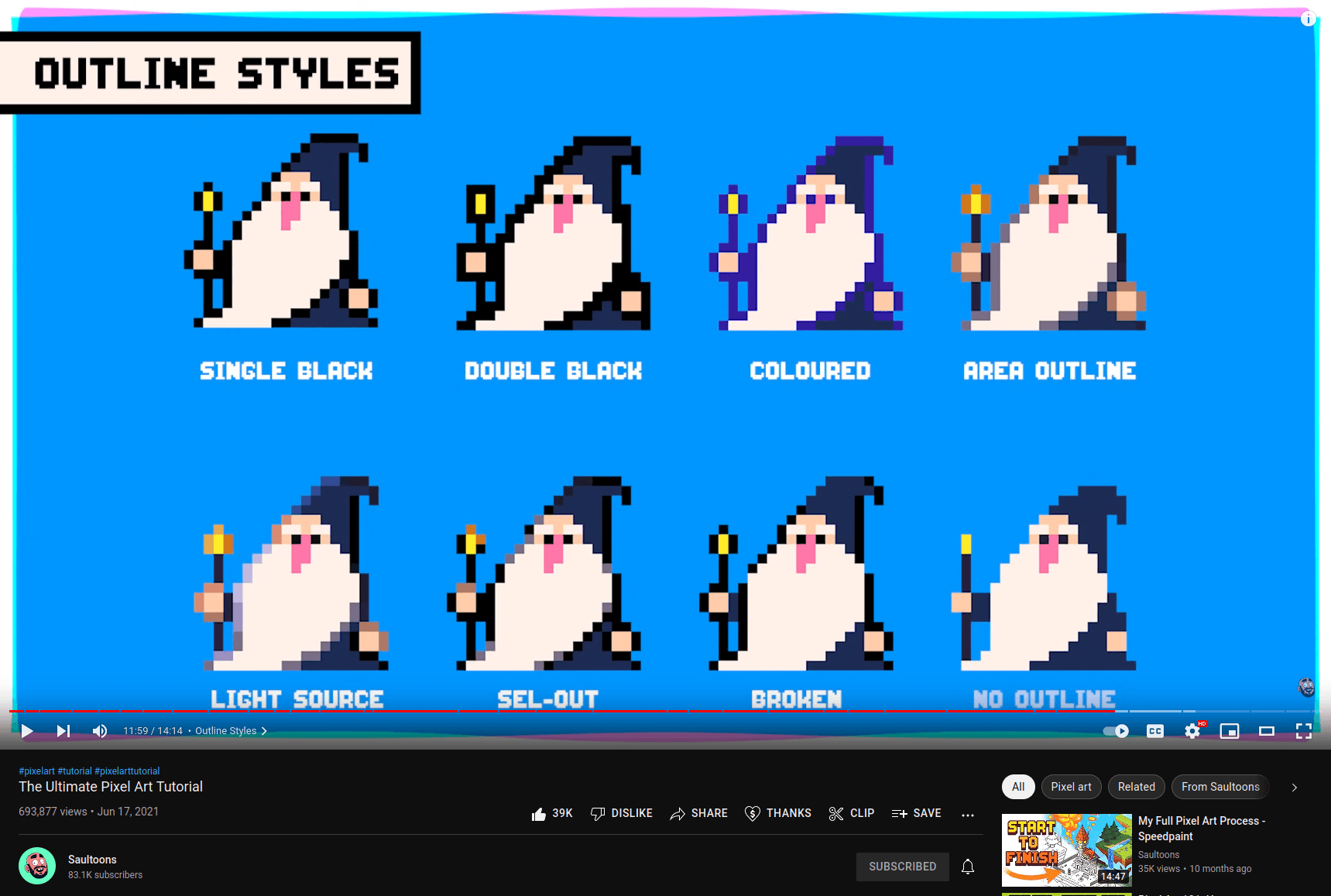
The Ultimate Pixel Art Tutorial - Saultoons
In this video, Saultoons goes over the breadth of things to consider when creating pixel art. If you are new to art in general, like myself, a lot of what is in the video will probably go over your head. It is however a good video to watch, then come back to after gaining more experience. At the very least it will give you the vocabulary needed to search for when looking for tutorials.
- The process for creating: Silhouette, Line, Color, Refine
- Value is the most important thing in pixel art
- Use saturation to add areas of interest or focal points
- Avoid orphan pixels, which are singular colors on their own
- There are multiple ways to outline
How To Pixel Art In 10 Minutes | Pixel Art Tutorial - Reece Geofroy
Reece Geofroy’s video has a lot of fluff and an annoying marketing call to action in the first quarter of the video. However, it has a very good explanation of highlight and shadow colors. You can skip to the 3:24 minute mark to get to the valuable part.
- Have 3-4 colors per material - highlight color, base color, shadow color
- To create shadow with hue shifting, take base color, decrease value, saturation, and shift hue closer to blue
- To create highlight with hue shifting, increase value, saturation, and shift hue closer to yellow. Or decrease saturation (no hue shifting)
- Increase saturation on solid objects (e.g. clothes or things in nature)
- Decrease saturation on reflective surfaces (e.g. metal, glass, or skin)
Pixel Art Color - Creating a Palette, Hue Shifting, and Color Theory | Pixel Art Fundamentals - Watt Designs
This is the best video I’ve found on pixel art color. Watt Designs first goes over how to actually create your own pallette from scratch. Then he discusses color combinations such as the monochromatic, complimentary, or analagous colors.
- If you don’t want to make a pallette, use a 32 color palette from lospec.com
- Recommendations
- EDG32 pallette
- AAP-64
- ZUGHY 32
- WAT32
- Recommendations
- Use complimentary colors to make things pop or stand out
- Use analagous colors for cohesiveness
- Colors convey emotion
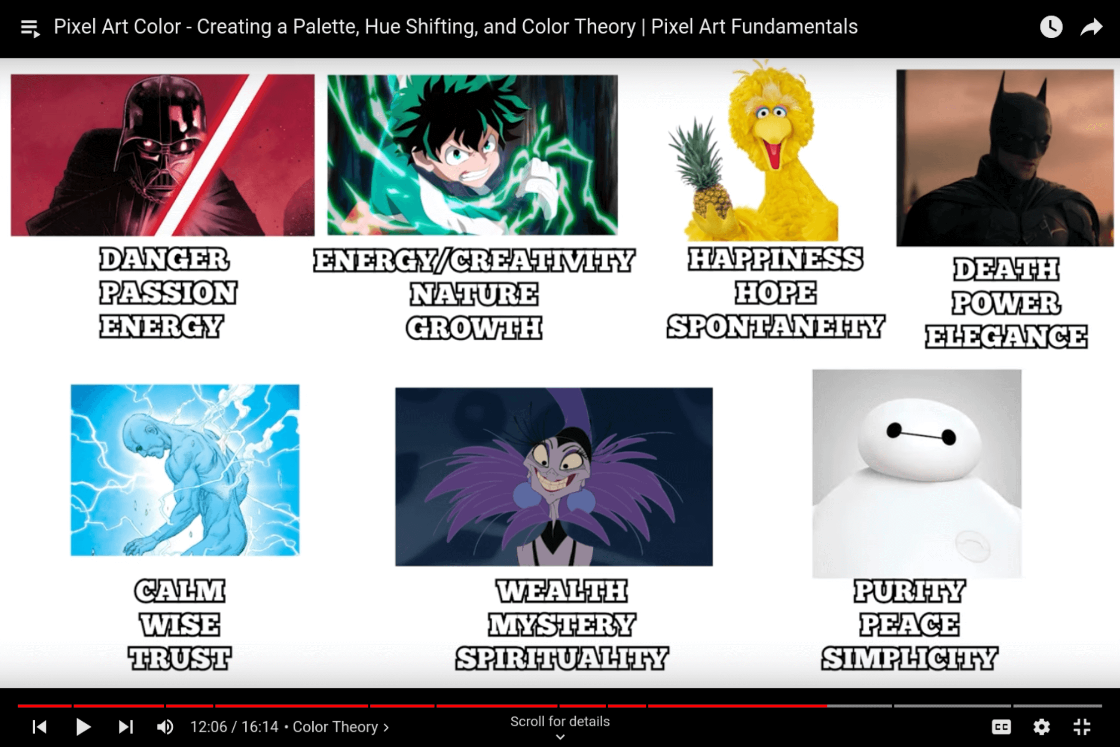
- Decide what you want your object, scene, or character to feel like, and then pick your colors based on that
- E.g. dark, spooky, and calm: use analagous cooler colors
- E.g. fast paced factory with lots of energy: use complimentary warm colors
- Use canva.com’s color wheel
- Don’t be afraid to deviate from the pallette’s saturation
- Contrast is important, art should look good even in black and white.
How to “Proofread” Your Pixel Art (5 Review Tips!) - Brandon James Greer
Brandon James Greer’s video seems to be catered more towards creating standalone pixel art rather than game assets, but there are some useful tips.
- Flip your canvas to see it with fresh eyes [Shift+H]
- Check the silhouette, this lets you check the readability from the overall shape
- Copy character into a new layer
- [Ctrl+Left Click] the sprite layer selection
- Press [F] to fill the layer selection with black
- View it in greyscale to check if everything is “reading as intended”
- Add a new layer
- Fill that layer with black
- Set that layer’s mode to “Color”
- Keep this layer on top and just toggle it on and off
My Personal Do’s and Don’ts of Pixel art! (How I make pixel art!) - Pixel Overload
The voiceover for this video is a little hard to understand. Some of the tips such as using anti-aliasing and not using black outlines seem to be more a reflection of Pixel Overload’s own personal preferences rather than hard rules. However, the video includes a great explanation and illustration of jaggies.
- Avoid jaggies which are a misplaced pixels that breaks up the pattern of a line
- E.g. for curves, the middle of the curve should be one pixel wide. 4,3,2,1 horizontal pixels then 1,2,3,4 vertical pixels
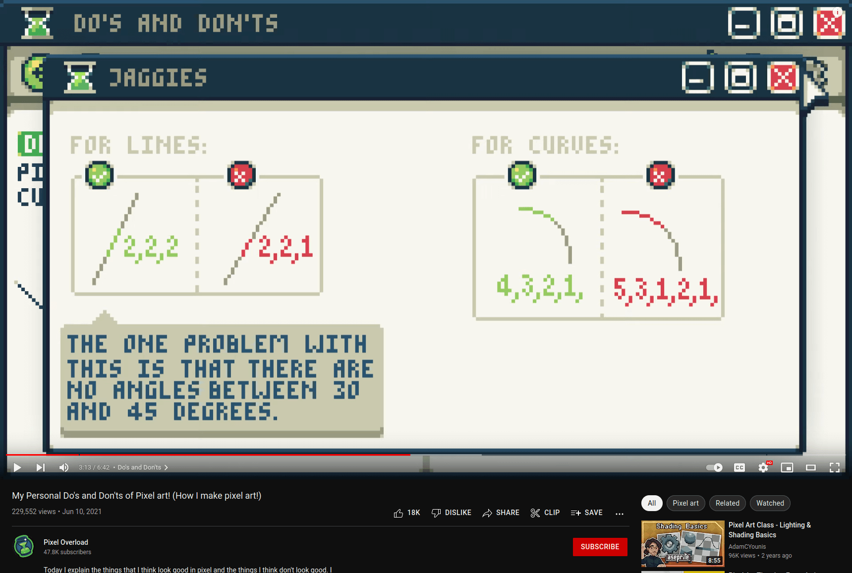
- E.g. for curves, the middle of the curve should be one pixel wide. 4,3,2,1 horizontal pixels then 1,2,3,4 vertical pixels
- Ease in and out of animations. For example, a jump animation:
- Starting jump: move 1, 2, 4, 16, 32 pixels up
- Top of jump
- Descending from top: move 1, 2, 4, 16, 32 pixels down
Key Repeated Takeaways
These are tips and recommendations that are repeated in multiple videos I watched, including some of the ones I didn’t write about above.
- Your art should look good in greyscale, because value is really important
- Use a color pallette from lospec
- Avoid unintentional doubles and jaggies in lines